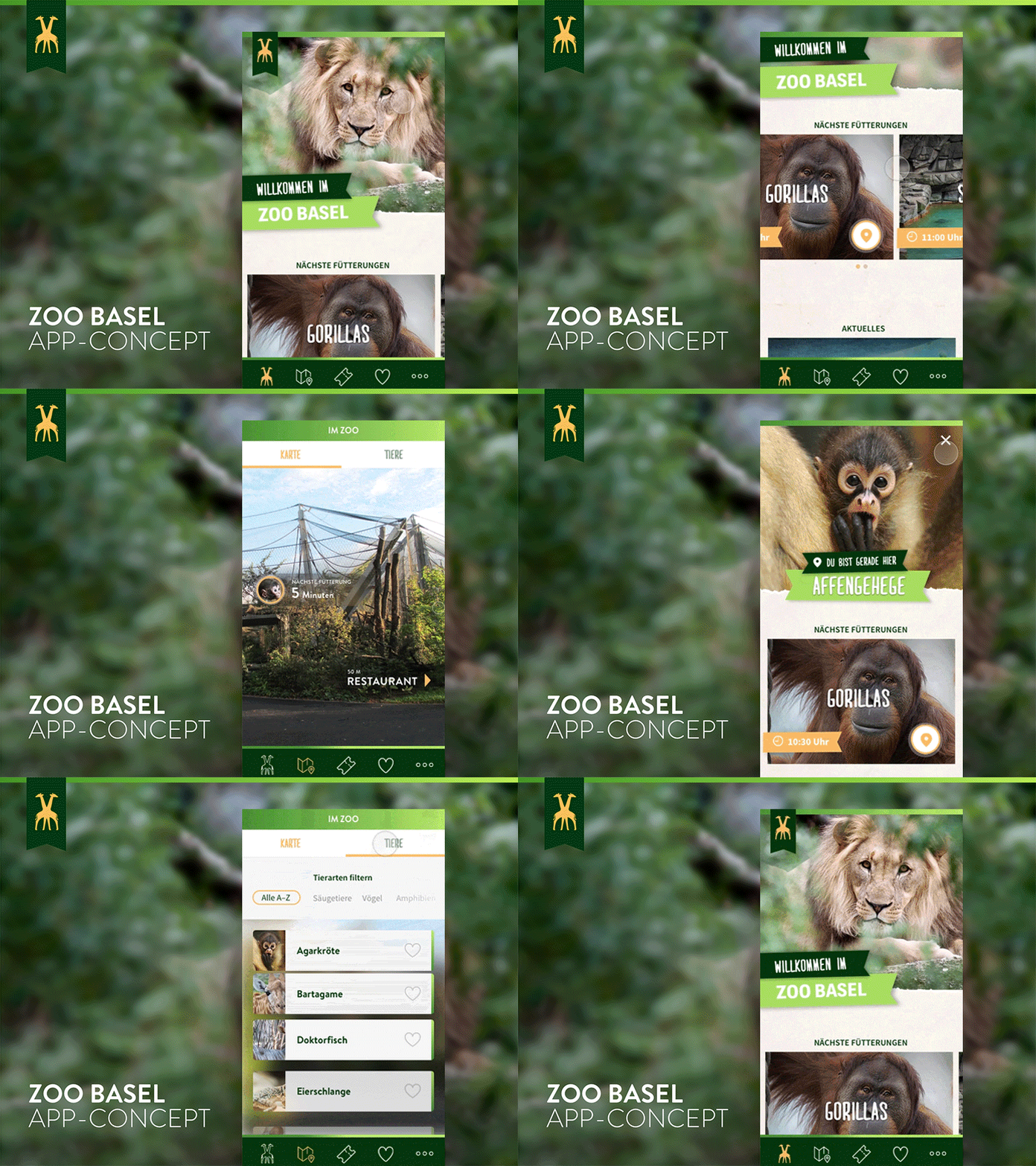
Zoo Basel App Redesign Concept
Hey!
That’s an early animated prototyp to test the experience of the app concept and how transitions feel for the user.
________
A friend of mine was wondering about the missing opportunity to buy tickets in the current Zoo Basel-App a few days ago.
He asked me about the reason to build an app like this without the functionality to buying tickets.
So i took a few hours, sat down and sketched my thoughts about an state of the art Zoo-App with some nice features like „your personal zoo guide“ with augmented reality elements, push notifications about upcoming events and feeding times in the parc, a favlist for your favorite animals, ticket shop… Therefore a little facelift for a more authentic and organic look with a tiny fun-vibe for kids using the app in the parc, was really important for me.
________
Press „L“ to show some love.
Thanks and have a great day!
