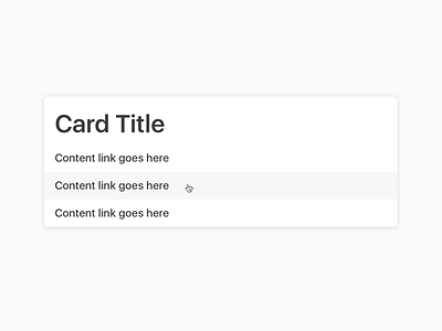
List Card
One of the things I miss about designing in code when I have to use Figma or Sketch is the box model. It adds a whole different dimension to the way we're designing. Padding and margin management within a front-end design system alone is a challenging task.
Lately I'm trying to design components that allow for sloppy interaction. As you can see in the screenshot, list items are vertically separated by padding only, so there's no dead area between them.
Generous touch areas are a must on touch devices, but they work really nice with a pointer too. Extending the interaction area to the full width of the components seems weird and old-school at first, but it's a great usability improvement.
Check out the attached files for a video demo of the interaction and a screenshot of the code (❤️ Tachyons).

