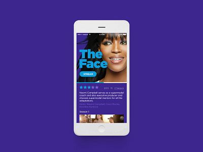
Home & Entertainment UI
The solution for the website echoed the overall theme; making everything “Bigger, bolder and brighter” yet clean while keeping the timeline locked at the bottom of the page at all times.
During this 2-month project my role was to design the colour palette based on the user researches, the network logo, typography, branded merchandise, network website and all on-air elements from lower thirds to pack shots.
More by Dilsah Eke View profile
Like


