Top or Bottom?
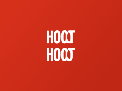
Developing the Hoot logo and I'm not sure whether the bottom one looks too much like a J instead of a T. What do you guys think?
Developing the Hoot logo and I'm not sure whether the bottom one looks too much like a J instead of a T. What do you guys think?