Fieldy 2.0
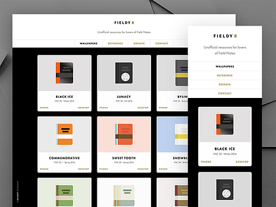
Introducing Fieldy 2.0! Made some big improvements to Fieldy based on user feedback and overall critique. Some of the improvements include:
1. An improved layout and style for navigation header.
2. Much better layout and responsiveness for viewing and downloading wallpapers.
3. A more consistent and easier to recognize style for links.
4. Fieldy now uses Futura, the preferred font of Field Notes HQ
5. A much requested Donate Page and easier to reach Contact link.
Will be showing some side-by-side comparisons and other work for this over the next few days.
More by Dennis Cortés View profile
Like

