Twitch Redesign - Explore

Yo Dribbble! After so long, I can’t wait to show you this project I'm working on.
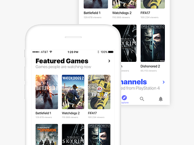
This is just a sneak peak of the redesign of the Twitch app that shows a part of the explore section.
I analysed the content from the Twitch site and the structure of the Twitch app to understand how to improve the engagement and the visualisation of the content.
I preferred to use a tab bar instead of the two actual sidebars present in the current app and tried to improve the navigation of the app itself.
For the font I used San Francisco, but I have to be honest, I was undecided about how to use Circular.
I use the font-tracking kindly offered by the Facebook guys in their amazing resource but to improve the readability of the font I had to customize it.
I hope you like this first part of the redesign, more to come in the next weeks.
Don’t forget to check the attachment.