Share with confidence
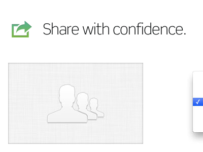
Another new features section. Definitely shooting for subtle here with the user icon, but worried that there might not be enough contrast. Considering darkening/inverting the icon. Any thoughts/recommendations?
More by Matthew Anderson View profile
Like
