Portfolio Cards
Hey everyone!
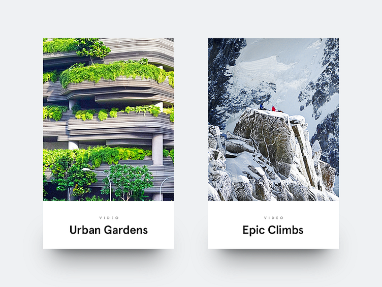
I’m a big fan of designs where the type becomes one with the photography. It just looks awesome. The downside, though, is that it’s quite hard to find the perfect photo every time. The words still have to be readable and you don’t want the image to lose its greatness. And that’s where white boxes can come in handy. Maybe it doesn’t look as amazing, but in the end it might be the better design decision.
More by Vedad Siljak View profile
Like
