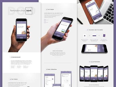
Doo Portfolio Page
I've been working on layout ideas for my new portfolio for a while now, and I think I've finally settled on a direction for my reminders app Doo.
This iteration is close. I'll probably revisit the iconography and content since I scrawled it fairly quickly. There's also an opportunity between the stack and list sections to talk about the card metaphor and the positive effects of motion design on the user experience.
Press `L` to like!
More by Michael Ciarlo View profile
Like

