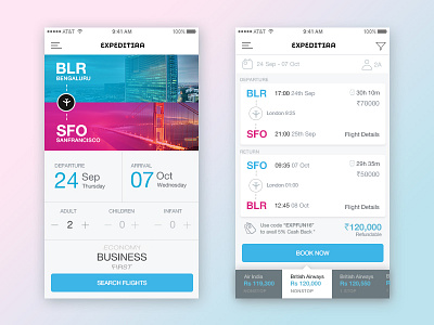
Flight booking app Interaction Design
A new approach in defining interactions for booking flight on mobile apps. This is an attempt to reduce human error as much as possible and to help users with clarity to make sound decisions while selecting their flight. Usually, the search listing screen would be loaded with many flight options, prices, dates, timings at one go. So this is an effort to reduce over load of content on the screen and increase clarity in providing what is necessary one at a time.
Appreciate you feedback, comments & likes on the design. :)
More by Nikhil Surendra View profile
Like
