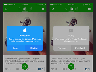
Sprocket iOS 1.3 Consistent Dialogs
In order to achieve maximum in-app consistency I have chosen to style in-app dialogs close to the same way as the iOS10 dialogs I can't control. This creates more trust in my bicycle services and makes all of the apps dialogs UI easier to maintain going forward. I have decided to fill my iOS dialogs with color to exaggerate the playful nature of iOS.
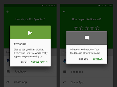
Adding a context-appropriate color and token gives faster feedback and conveys a richer visual meaning to the proposed interaction. For example: dialogs about going out to the Apple App Store use App Store blue and the Srocket app rating dialog is green to match the app's branding. I have made this style a consistent element throughout the iOS app and a crossplatform consistency feature in the Android Sprocket design as well.
Check out the current Android app here.


