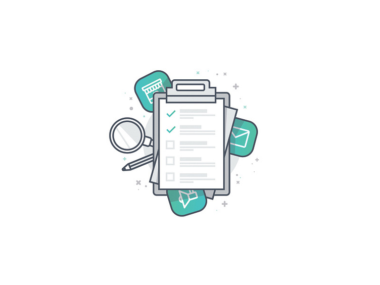
Checklist Graphic
A little graphic for Kit's new-user onboarding.
I have no idea what illustration style will ultimately be used for the Kit brand, but for now, I'm using a single stroke weight and 2 colors/4 shades. Flat, with depth (if that makes sense?)
I'm going to play around with roughened strokes, an additional stroke weight, and some textures.
More by Josh Martin View profile
Like
