Sticky Sub Nav Concept
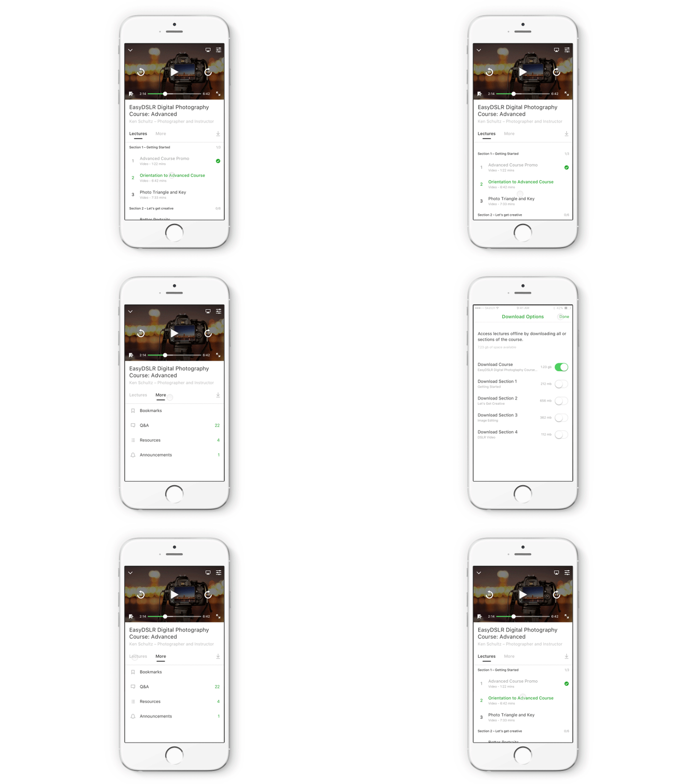
I’m working on an idea that introduces a tab navigation that aims to help students access course taking materials more easily. The navigation is separated between the primary content type, “Lectures”, which are typically videos meant to be watched sequentially, and the supplementary content types, “More”, which are things like PDFs, images, articles, or other resources that instructors add to their courses for students to reference while taking a course.
This design also makes the supplementary content and the download options accessible at any point throughout the course taking experience. In the current implementation, these items scroll with the other content on the screen which makes them accessible only when scrolled to the top of the course curriculum. If you're taking a course with over 100 lectures, it becomes a pain to scroll all the way to the top to access a needed resource.
Thanks for checking it out, would love to hear what you think!

