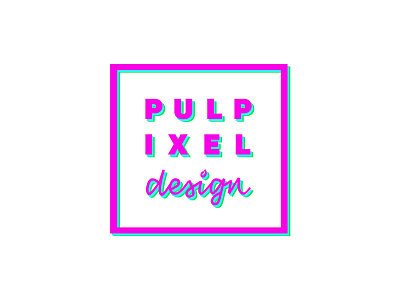
Pulpixel Design - New Logo
This is the final logo of my creative studio after a full rebranding lasted several months.
I've paired a solid "ultra-black" sans-serif for naming with a slightly squared calligraphy for tagline.
Since the naming is quite long I split the 8 letters of Pulpixel in two rows of 4 letters each. In this way stands out also the hidden meaning of the word Pulpixel, that is "a pulp of pixels".
To fit the tagline width I increased the kerning of naming. so that the 3 rows form a square.
Then I included naming + tagline into a larger square with a thick stroke.
Lastly I've matched the logo with bright and iridescent colors.
What do you think about?
More by Giovanna Mastrocola View profile
Like
