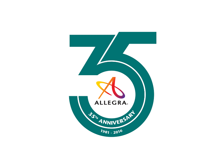
35 Logo Sample
Allegra is a print and Marketing company, with clients and companies in various industries. I was asked to design a new logo for the 35th anniversary.
The logo is my take on classic centennial logos. Since the corporate logo is a color spectrum, we needed a stark contrast that worked well. I reached out and worked with my team for multiple color combinations.
To further balance out the contrast of the color spectrum in the corporate logo I chose a sans serif typeface and the collateral look professional and iconic.
More by Mark C. Mathis IV View profile
Like
