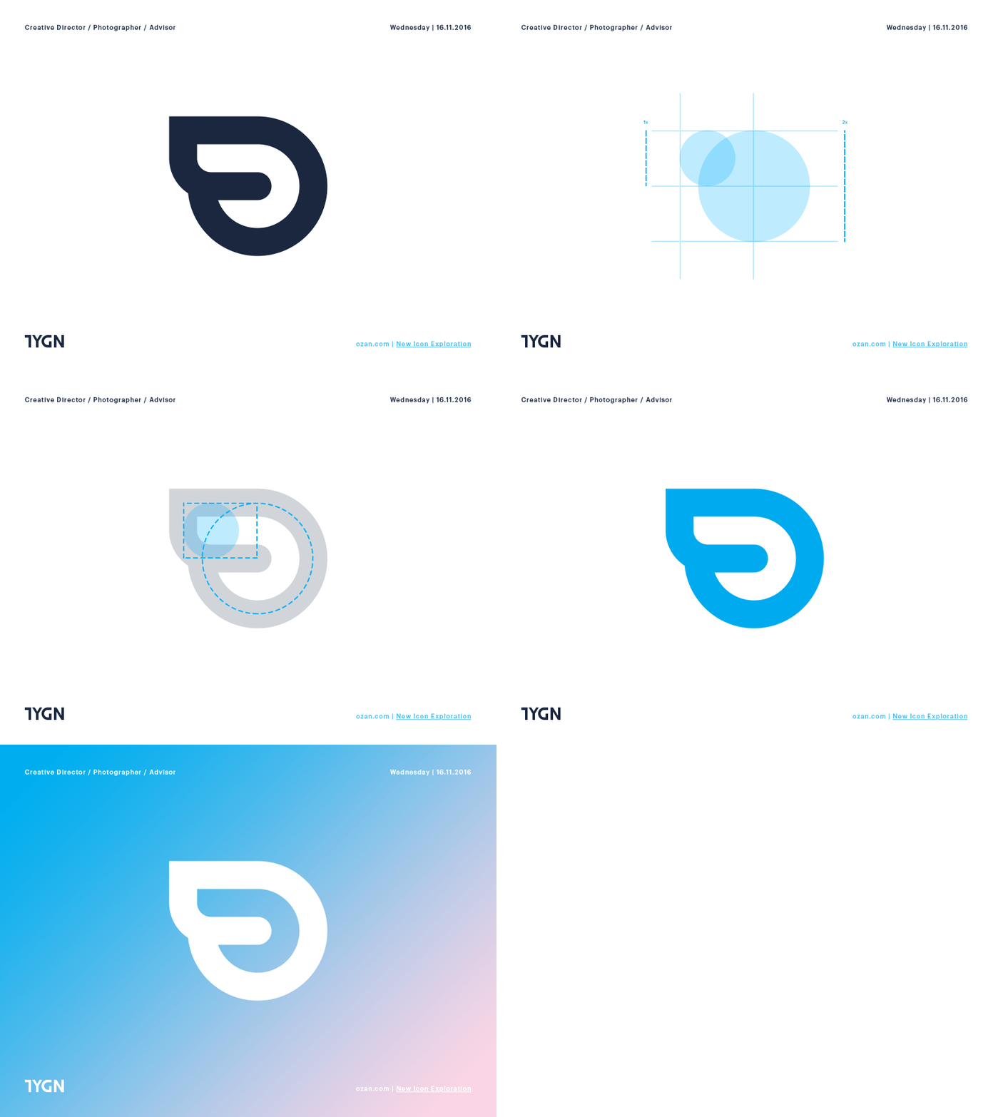
Ozan - Icon Exploration
Meticulously detailed approach for logo-type renewal
We have a designated and diligent team poring over every detail of our brand to achieve our vision. Upon reassessing our old logo, our designers noticed a few shortcomings and set out to create an even better one.
To make the logo even better, our team identified 3 key aspects:
Logo & logotype bound together was creating a faulty visual flow when used in different platforms.
Logo, created by utilizing the capital letter “o”, had alignment issues when used as an icon or an avatar.
The wings of the logo that visually symbolized speed had anti-aliasing issues in smaller versions of the image.
Here’s the new logo, improved...
More by ozan View profile
Like


