Project Card Example
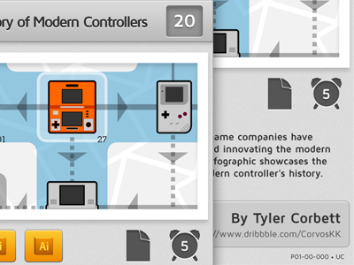
Here's a small teaser of what the game will look like. This may not be the final art direction, but I do want a very clean, neutral design for the cards. This is an example of a "Project Card" which is basically the character card that you would find in other trading card games.
On the left you see the top-right of the card. Here is the name of the project, as well as how many points your project adds to your portfolio (the end goal is to have a high-scoring portfolio). Below the image you can see the area that shows what you need to have in order to add the card to your portfolio. The left icons show technologies, the second to right shows your development environment (or media), and the far right icon shows your "schedule." This shows how many turns you must have the card on the field before you can add it.
Each project also has a description and an artist byline, which you can see on the right. The cards also have a black border, but I didn't show it due to space. You can see the full card design in the attachment.
I know it's not much to go on yet, but critique would be beyond appreciated.

