Line Chart Toggle
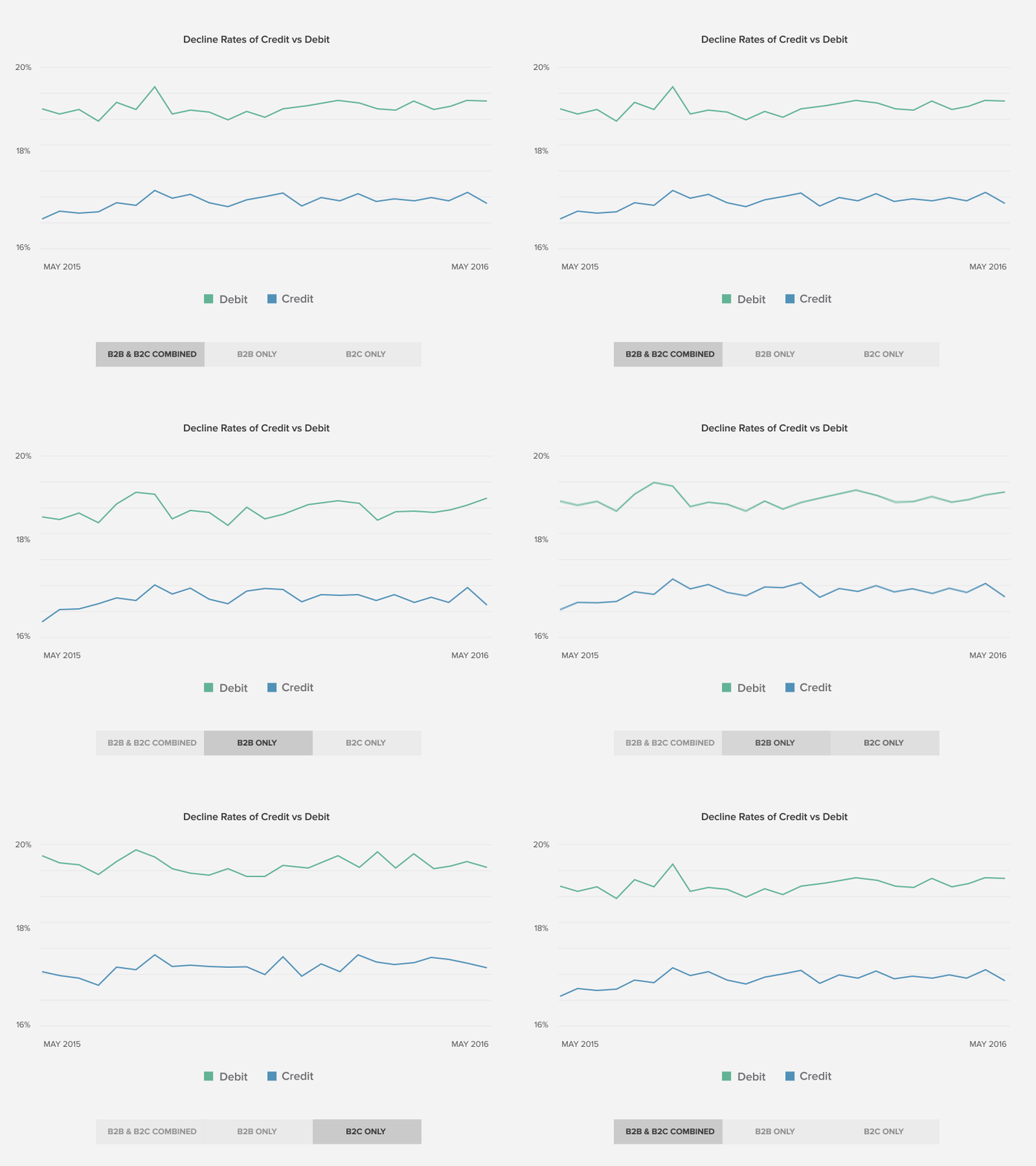
A quick mockup to illustrate an idea for a toggle on a line chart. I want users to be able to see the difference between two data sets. This way it's possible to see the decline rates of credit vs debit combined and separated by B2B and B2C.
I plotted the data in Google Charts originally - but did a quick animation test in After Effects by just moving spline points around on the timeline.
More by Recurly Design View profile
Like
