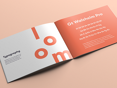
Typography
When choosing a typeface for a brand, make sure it matches or compliments the logo. Yep, I know...pretty straight forward. So, open up your thought process for choosing type and think about the brands colors, photos and illustrations as a whole.
I chose GT Walsheim Pro by Grilli Type because it looked fantastic next to the mark and it played well with the illustration style. The illustrations for loom are blocky and strong, so when searching for type I made sure I found the right sans serif that would complement that exact styling.
If you’re interested in brand position and identity design, shoot me a message at kyle@kylemillercreative.com
More by Kyle Anthony Miller View profile
Like

