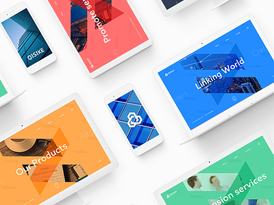
QISIKE BRAND
CLICK TO VIEW QISIKE BRAND DESIGN
The logo uses the shape of Q from Qisike and the structure of hexagon to form a regular triangle by the connection and rotation of three Qs, to indicate the Technology and Internet nature of the company.
The sharp angle on top represents mountain peak to show the company’s pursuit of innovation, perfection and a global vision. It also shows the conversion and contradiction between art and technology, like two sides of a coin; it is innovation that connects them together, it is also the soul and the passion of Qisike.
@Hsany completed this project together with me! 👏
More by SEE View profile
Like


