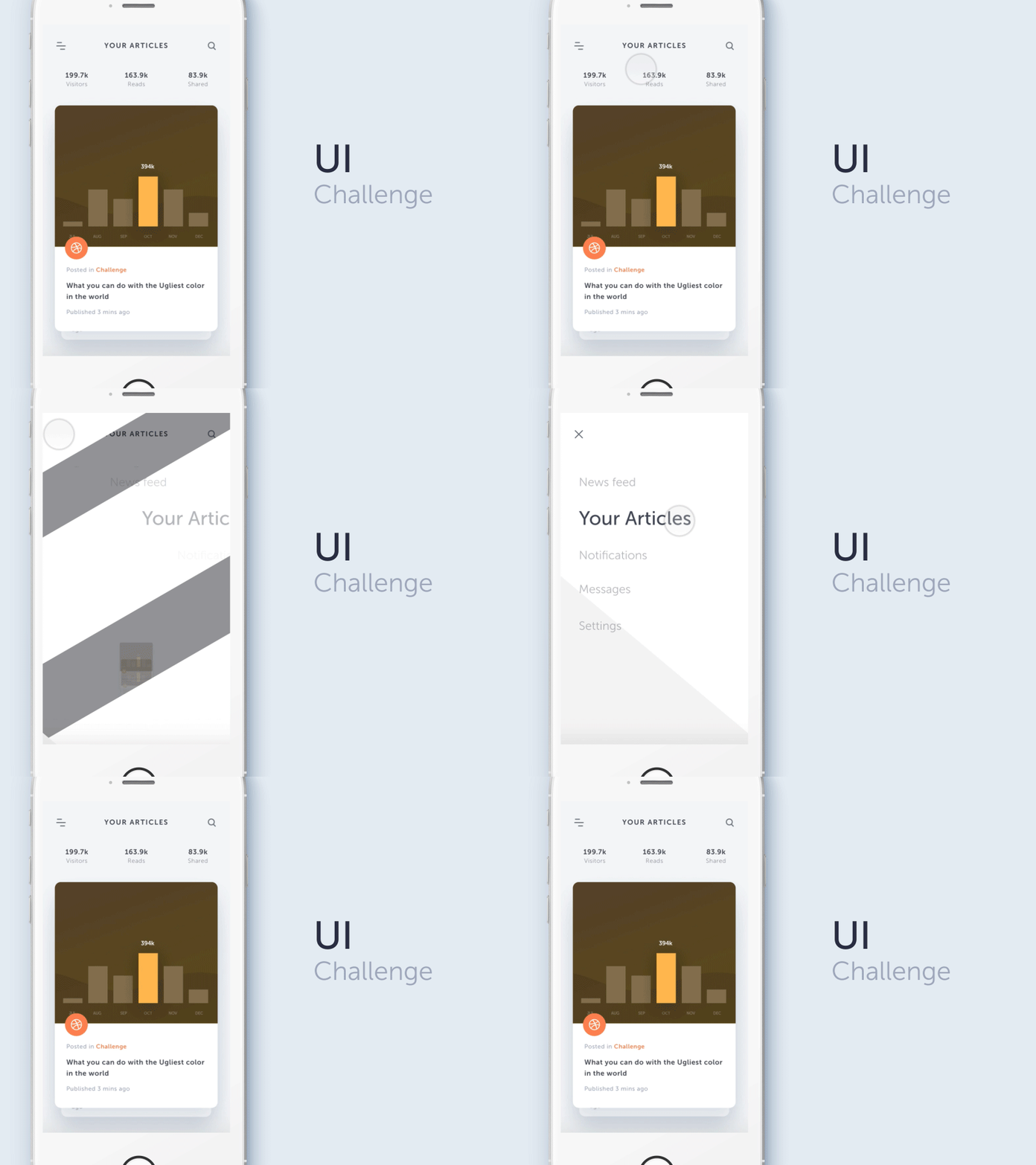
Ugliest Color in The World - UI Challenge
Hello dribbblers, long time no push some pixels :)
Few days ago, I have a talk with few friends and inspired by this article :
http://www.huffingtonpost.com/entry/ugliest-color-pantone_us_57570df6e4b0ca5c7b504538
then we're decided to challenge our self. The challenge is : "what you can do with the ugliest color in the world?" - Pantone 448C
I'm first! This shot is my attempt. To be honest, the Pantone 448C is so challenging to be applied on UI. I've did my best but I got no luck here, the design still looks not good :D
Feel free to join the challenge and rebound this shot !
-----------------------
Sidebar design inspired by @Thomas Budiman Transition inspired by @Creativedash
More by Ghani Pradita View profile
Like
