KUNSTHAL Rotterdam | Signage & Wayfinding System
The Kunsthal Rotterdam is a famous building by dutch star architect Rem Koolhaas. It serves as an art exhibition space containing several rooms or halls, each one hosting individual exhibitions. At Teldesign I developed a signage system based on the existing logo (designed by Teldesign in 1992).
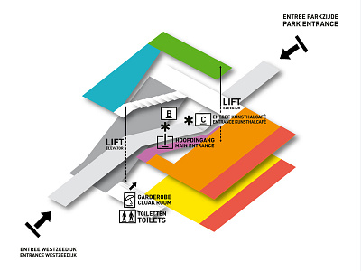
The main concept is to mark the different exhibition spaces by attributing to them numbers, letters and colors in order to facilitate the navigation of visitors through the complex building. Keeping these indications to the necessary minimum leaves all possibilities to explore the building in an intuitive way.
The three main halls are designated with the numbers 1, 2 and 3, which correspond as well to the main floor levels of the building. The other spaces are marked with the letters A to F, referring to the functional names of those spaces: A – Auditorium, B – Book Shop, C – Café, D – Design Gallery, E – Etalage (Window Gallery) and F – Fotogalerij (Photo Gallery).
In order to visualize the functional difference between exhibition spaces and other general spaces, all the spaces containing art are given colors. The range is kept basic in order to be easy to remember and to create a clear distinction between those spaces. In favor of the intuitive navigation the colors are spread from warm (basement) to cool (upper level) through the building.
The signs identifying locations are marked on the ground on strategic positions, whereas signs giving directions are marked on the walls vertically. Together with a simplified floor plan, exhibition overview posters form the link between those halls and the actual, sometimes weekly changing exhibitions.
