Payment Page
Hello dribbblers!
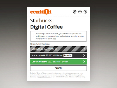
💸 Centili Payment Page, version 2.0
After three years, I realized that our Payment Page needed a full redesign. Just after Tovla left, I went researching and collecting ideas from a competition and similar industry products. Next, I compiled approximately ten questions for our partners, concerning Payment Page usability. I asked our support team to get in touch and forward my questionnaire. They did and helped a great deal.
With a ton of new interaction and visual design ideas on my mind, I had a bunch of fresh ways to improve the outdated Payment Page as a product designer. Finally, I gathered all the ideas into one Jira task, opened internally for everyone to contribute constructive ideas, suggestions, inspiration, etc.
“Perfection is achieved, not when there is nothing more to add, but when there is nothing left to take away.”―Antoine de Saint-Exupéry.
The initial version of the Payment Page had a ton of interface elements crammed and bloated on one single page, and It was like everything was competing for attention. There was no focus! I removed unnecessary buttons and fields first; then I took more a step-by-step approach to focus the user on one thing at the time. I defragmented our old cluttered page into a couple of clean and focused ones by dividing user actions to single action per page; i.e. step. The result was elegant, more minimal and cleaner UI which had a notable impact on decreasing the time required to complete the payment flow. This certainly meant a better user experience. Success!
Read my full mobile payments product design case study. More graphics coming soon (o^-^)o o(^_^o)
Press "L" to appreciate. ✌️


