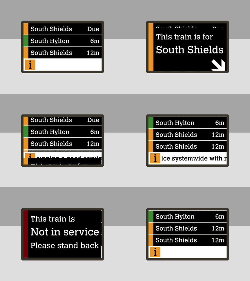
Tyne and Wear Metro Departure Board
Central Station updated recently to have new departure boards, similar to the ones at Haymarket (https://www.instagram.com/p/-ottPWhHEa/?taken-by=headbangerkenny). The problem is they don't seem very friendly in comparison to the old ones.
My main issue from a design point of view is they put "This train is for South Shields" in the info box at the bottom, which isn't great when you see a train on your platform and need to know where it's going!
Also to make it clearer, I added the line colour to the side (with a red for not in service)
I mocked up what I think it could look like in Keynote and finished off in Photoshop.
More by Joe Simpson View profile
Like
