Architect's logo
Currently working on a branding project for an architect. The concept behind the mark and branding in general is welcoming, wise, trusted, rigorous and timeless.
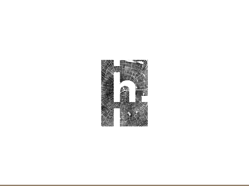
Decided to use a floorplan as an outer container and match it with the shape of the lowercase h to add some dynamism and not use purely straight lines. The using an organic texture on the inside of the shape is to relate to the work style of the architect, which is pretty rigorous on the outside, but within the spaces he makes the spaces feel like home, like a habitat. The choice of wooden texture is due the material being both flexible and solid, as well as wise. Wood is also considered a warm and welcoming material, it just fits perfectly with the concept.
The mark itself is quite flexible, allowing to play with different dimensions of the outer shape as it could morph into rectangles of different sizes as well as a square.
This is a bit of a WIP but getting to the final stage now.
