Simple Errors
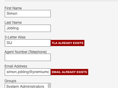
I'm currently updating the forms UI across an application, specifically around obvious but friendly error handling.
I'm keen to keep the language relatively simple, using the common pattern of [object] [error].
I also wanted to make the errors glaringly obvious when the system returns them yet not overwhelm the user. By aligning the errors directly next to the field, it guides the user to error quickly and effectively.
More by Si Jobling View profile
Like

