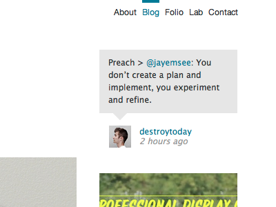
destroytoday.com / latest tweet
I wasn't happy with the look of the 'latest tweet' on my site. As Mr Mangold pointed out to me, the text-on-white blended too much with the rest of the text on the site. I also removed the subscribe and follow buttons for now. They just didn't look right. I'm not sure if it's the perfect solution, but it certainly looks better than the previous one.
Check it out live: http://destroytoday.com/blog/
More by Jonnie Hallman View profile
Like
