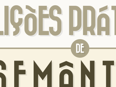
Dropped draft of the cover of a presentation
Really enjoy the erratic alignment from the accented chars and the Ç, but this typeface is miles away from the feeling I want to transmit.
It was lots of fun laying it out, though. I'm switching to good old gotham.
More by André Luís View profile
Like
