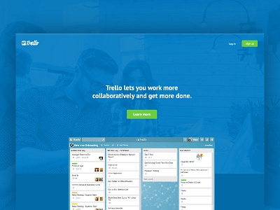
Daily UI (003)
Day 003: Landing page
-
I use Trello for most of my projects, and it's a great way to keep track and assign tasks during a project. But their current landing page (image) is way to cluttered and all over the place. Decided for this daily challenge to redesign/simplify their landing page; Get rid of a few elements and give structure, but at the same time keep the "selling element" of the page.
-
Font(s) used
► PT Sans
—
Thank you for watching!
More by Andreas Wikström View profile
Like

