Finesse Interiors
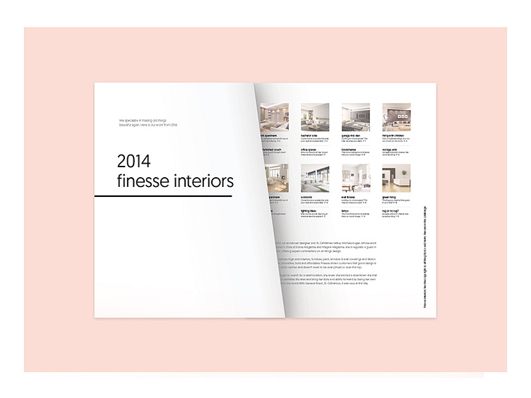
Created to bring about a sense of newness, revitalization and simplicity.
The colour palette chosen allowed for expansion as it remained free from current trends. Alternatively, the imagery, was trendy, changing throughout seasons. The font Geomanist was chosen for it’s variety of widths and accompanied with a line and arrow icon that carried throughout each marketing piece.