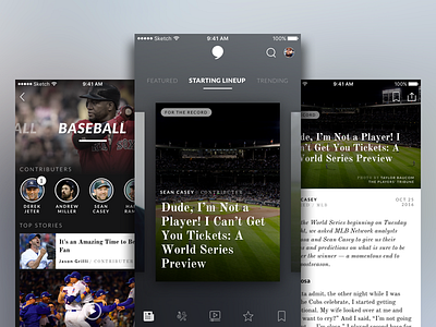
Sports Blog App
Hey guys,
Here is a first pass at a quick mock-up I was playing with for a popular sports blog that currently doesn't have an app. The design is meant to lean towards dark/muted tones with high contrast of black/white, with pops of color imagery.
This concept focuses on a card/tile display with heavy emphasis on force touch. Interactions will be posted shortly :)
Please let me know your thoughts and don't forget to press "L"
Thanks!
Ryan
More by Ryan Stone View profile
Like


