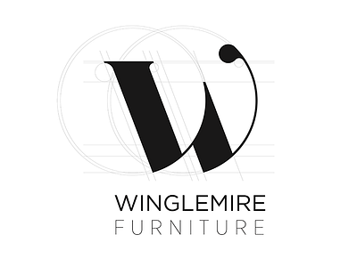
Logo concept for the family store
I've been exploring a lot of letterform sketching lately. I recently started messing with W's because of my families furniture store. I wanted something classic, as they are very traditional and their current logo is script. I was looking for a form/lettermark that felt simple, delicate, architectural even, with just enough unique character. I feel like I dig the direction of this W, but I'm curious for some feedback.
More by Dwayne Raupp View profile
Like

