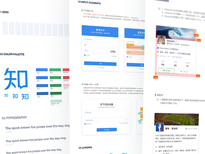
Zhihu Web 2.0 Guidelines
Sneak peak at our Web 2.0 guidelines. Using a consistent color scheme throughout this version creates a color harmony and comfortable user experience. The styling of font typefaces also make a change. Compared with the previous style, the new one increases the font size, and resets font weight by making a comparison between the different font typefaces and weights for the text faces. With the clear and expressive style fluency, I hope you guys like the new version of Zhihu Web 2.0.
If you like it | https://buymeacoff.ee/nealgao
More by Zhihu View profile
Like
