Comments and Comparison Block
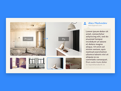
Comments and comparision block from a landing page i was working on a while ago. If comment text is too long you can click on it and it takes the comparision part to the left with a gentle slide and comment takes the whole space. If you want to go back to original screen you just press the button on the left.
More by Olek Miedviediev View profile
Like

