Reddit: 30 Minute Design
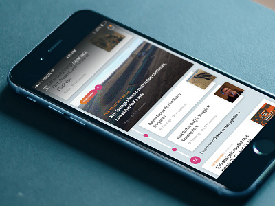
This was a quick 30 minute exercise to see what a Reddit app might be like if there were some more smarts around curation. The design demonstrates a stream of posts about the Dakota Access pipeline and what that might look like inside a feed.
I started to hint at a color palette that could draw the eye through the timeline. I also varied the size of each card to give more weight to story streams. There's also a halftone treatment on the image to lend some personality. I'd use this app all time time!
Press `L` show some love!
More by Michael Ciarlo View profile
Like
