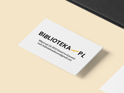
Biblioteka-PL logo
Visual identity and website design for Polish library in Leuven aiming to promote Polish culture and literature in Belgium.
Background: Katarzyna Radomska, founder of a non-profit organisation Daskalia (in Leuven), reached out to me to design a visual identity and a website for their newest initiative - the very first Polish library in Belgium. Library features Polish authors and aims to promote Polish culture and literature in Belgium.
Case: Library is situated on Wipstraat, which is actually a "street of seesaw" translated roughly. We decided to implement the shape of a seesaw into the logo. Library haven't got a name yet when I started designing, but a website domain was already booked: biblioteka-pl.be. "Biblioteka" means "library" in Polish. I found it pretty straight forward and charming at the same time, so we kept it as the library official name.
For the logo typeface I went for Lato - which is a sanserif typeface family designed in the Summer 2010 by Warsaw-ased designer Łukasz Dziedzic.
