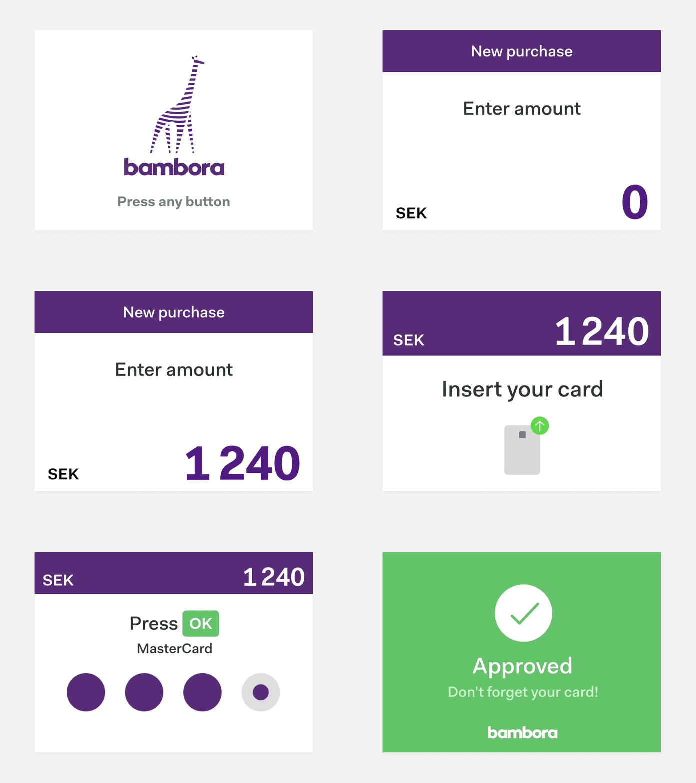
In-store payment (device UI)
Is it possible to add some personality to a static, in-store payment screen? Here’s our new design for in-store purchases (on a card terminal/device). We brightened the UI, adding splashes of Bambora purple, and simplified the text. The transitions slide in and out to guide the user.
Hope you like it!
More by Alexander Hedin View profile
Like
