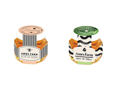
Ames labels
Testing some quick label mockups for two rebrand concepts. Ames Farm makes honey and one of their big sellers are these small 2oz jars of small batch honey.
Originally I presented three concepts:
Personalized Beekeeping
Botanical Nature
Honeycomb Detail
Since then, the botanical concept has been ruled out for their use. We are now between the one focused on patterns reminiscent of honeycomb, and the one focused on artistic expression. Both concepts have a way to expand the identity pieces for their series of flavors (varieties of both clean graphic patterns and organic brush patterns).
To help decide between the two concepts, I mocked up one of their 2oz jars of honey to redesign the label using each concepts elements. This is allowing the client to get a better feel for each and how it will look in-use. Also attached are images of a variety of the honey flavors together.
Any thoughts or comments? I'm liking both and not favoring one or the other quite yet. I thought it might be a nice idea to get some comments from the community.
Their market is a variety of different demographics. Both those who shop at a local farmers market and appreciate a handmade local product. As well as higher-end shops, as an artisanal, elevated product of high quality. And also some in between such as local coops, gift shops, and grocery stores.


