Gyroscope Lite UI Concept/Mockup
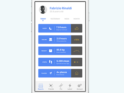
I love Gyroscope—in fact I'm a Pro user—but lately I'm not fond of dark UIs in general, so while it makes sense for their app (which looks awesome), I just wanted to experiment with a white background and a more colourful interface.
I've made this in Sketch just for fun, some colors are obviously off and the right side dark stats "panels" could use more tweaking. That said, It doesn't look too bad and I hope they'll consider a light mobile theme in the future.