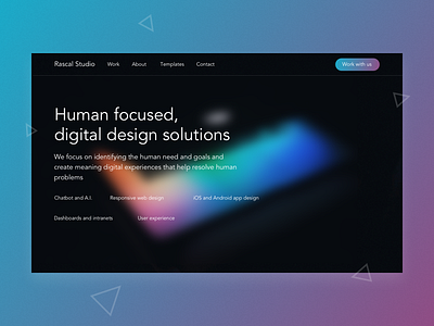
Rascal Studio - Homepage Concept
Some practice using gradients, background blue for a dark-skin website look and feel. This concept is for a side project I'm working on very much in the explorative phase.
Feedback welcome! Aiming to go quite minimal with a focus on showcasing services we offer and highlight/discuss the focus on 'human-centric' design.
More by Ben Low View profile
Like
