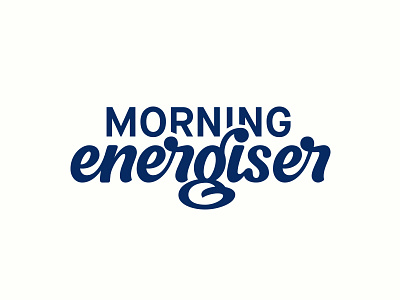
Morning Energiser Rough
This is the early Vector stages of a little something i'm currently working on!
Thought I'd share it with you get some feedback on the concept. I'm aware it's very unrefined but other than that what else do you suggest?
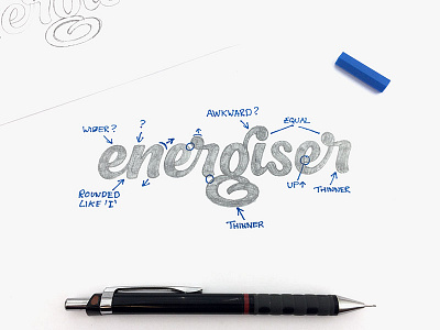
Something I'm going to do is use a more condensed Font for 'MORNING' so that it's more legible, with less cut off of the I and N. I might print out and label all the points that need attention if that's something that people would find value in, let me know?
Hope you like it!
More by Joe Sutton View profile
Like

