Atlas Revisited
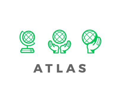
The UI for the app is being revisited, so my supervisor and I wanted to revisit the logo. These directions instead use the image of a globe as this tool represents the world of our online courses. Two of the directions tying itself more directly narrative of the Greek myth of Atlas, while the first is more of a general symbol of a globe.
Let me know your thoughts; which mark do you think is stronger? Which solves the problem best? Let me know in the comments!
More by Aubrey Casazza View profile
Like
