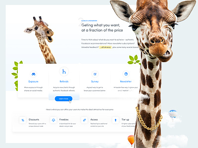
Girafi – it's time to grow big
The premise of Girafi is to cut down marketing and customer acquisition costs for e-commerce sites. The people behind it recently finished their acceleration program at the Berlin based Axel Springer Plug & Play and approached me to redesign their landing page (which is still visible at girafi.com for the time being).
We met up, had a coffee and talked about their goals and expectations - one of the first things they said was that they hope it’s obvious they don’t want giraffes on the site. So... I did the exact opposite, and the first thing they saw in the initial design was a giant ass giraffe with a golden chain on its neck… and they loved it. :D The aesthetics are somehwat focused on so called early adopters (think ProductHunt users) but the plan is to tune down the crazy once the product matures... maybe.
The real challenge here was writing the copy (spent a good few hours on writing and tweaking it) and presenting the product in a way that makes it easier to understand and conveys its value. Overall, I’m pretty happy with how it turned out though – what do YOU think?
(full pixels attached)

