FJ Mark
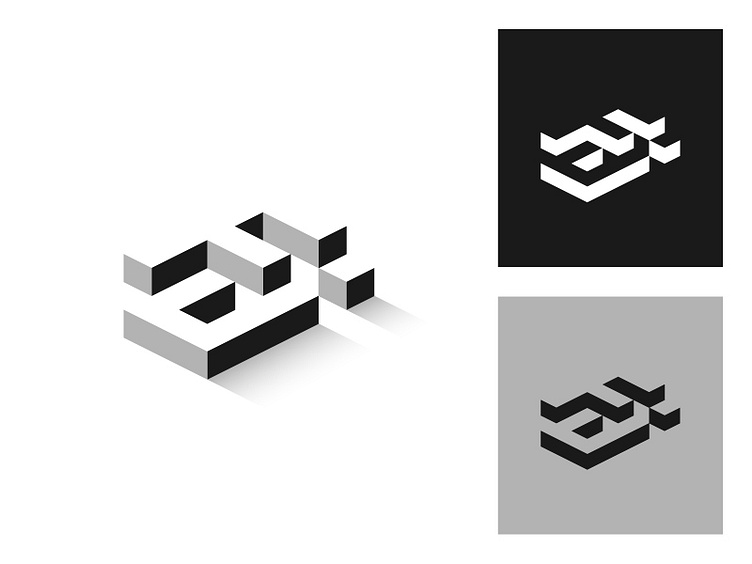
Logo done for an architect firm, I used negative space to form the letters F and J. The logo shapes also resemble apartment buildings in an isometric viewpoint. Hope you guys like it!
Logo done for an architect firm, I used negative space to form the letters F and J. The logo shapes also resemble apartment buildings in an isometric viewpoint. Hope you guys like it!
