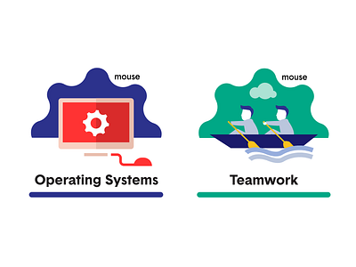
Mouse Create Badge Design
Our client Mouse challenged us to design a badge system that didn't look like badges! Here is how we tackled that — our process and solution. How did we do?
Our challenge:
To design a badge system that didn't look like badges. Designs needed to be both whimsical and professional looking. We also needed to offer a template to our client, Mouse, so they could use it themselves to create badges quickly and easily as their achievement library grows.
Our process:
We considered the purpose of a badge:
-a badge must be fun to get
-feel like an accomplishment
-they have to work alone or together as a set
-the set must work as 2, 4 or 50
-they have to be flexible in design to allow for new badges in the future
- must work at large and small sizes to view well on various applications
We considered what a more traditional "badge" looked like: actually uses a badge shape, or is housed within some sort of background container or shape, each badge has some similarities to work together as a series.
Our solution:
-A series of achievement icons that are not 100% contained within a shape (at some point the art must break out).
-A background shape that is inspired by their logo, and not a traditional "badge" or "trophy" like shape.
-Guidelines for style of art but freedom to allow that art be unique for each icon. A palette of 12 colors (4 colors and 12 shades) to work with.
-With these guidelines and a set of examples, both our team and Mouse has been having fun creating badges.


