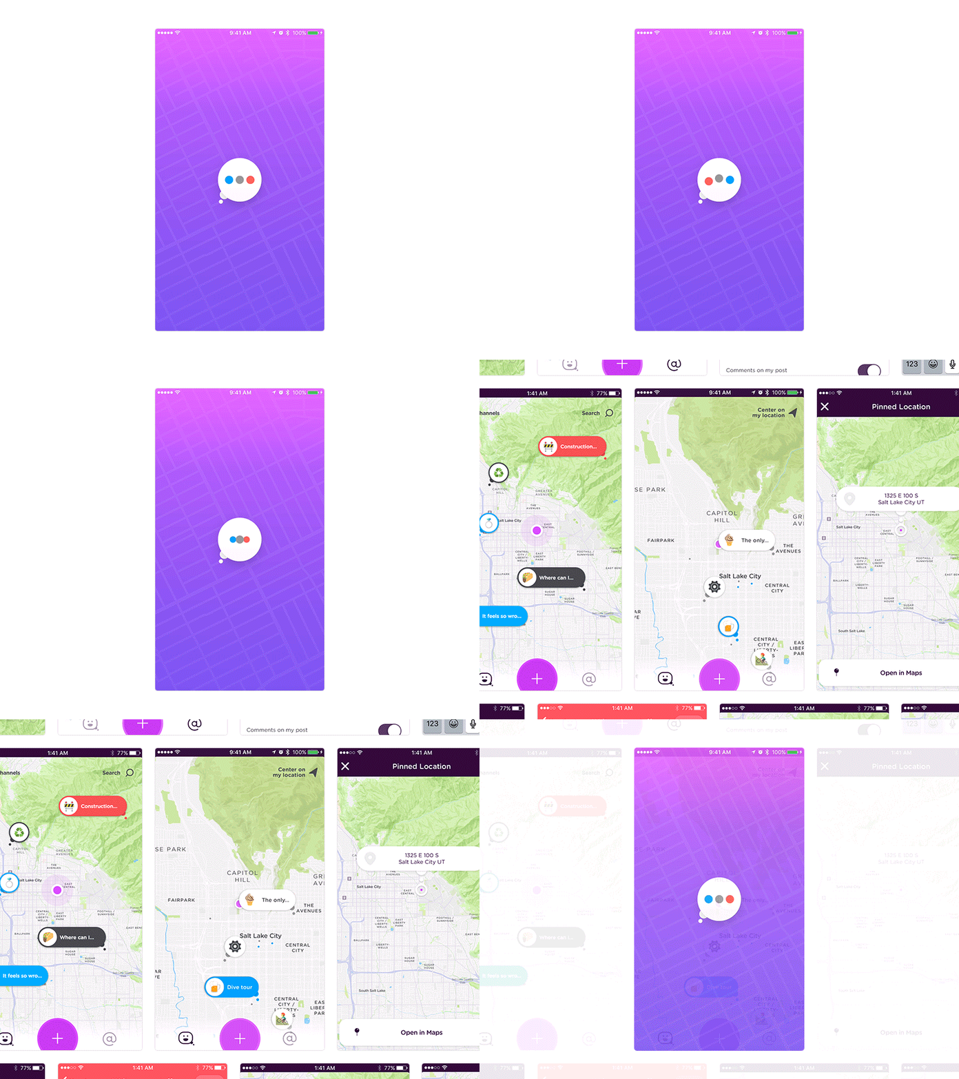
YouMap Intro Animation and Launch Screen
Earlier in the beta for YouMap we followed Apple’s suggestion of previewing the UI for the launch screen nib. I’m a big fan of this approach. Unfortunately, we ran into some issues with this solution. Even though we could show the UI right after the launch screen there is a lot of location, data and network activity that wasn’t ready. The result, after the original launch screen, was a broken and choppy experience.
The solution proposed and implemented by Adam Luptak was to instead have an animation hiding all of the UI until we could guarantee we had all the necessary user information, relevant post data and map tiles loaded.
The shot above is a screen recording of the latest build loading. Attached, you will see the design of our original launch screen (UI preview) and the design of new implementation.
The concept, programming and animation and all the hard stuff was done by Adam. The visual design and all the easy stuff was done by myself. 😬
You can view this intro animation in a real living app! Unfortunately, it’s only open for people located in SF, NYC or SLC (one of these is not quite like the others…). Contact us, youmapbeta@rallyinteractive.com, if you are interested.


