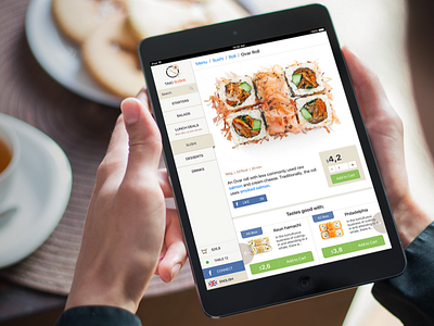
Taki Sushi iPad Menu
Modern restaurants change the paper menu on the electronic with tablets. Japanese restaurant "Taki Sushi" implemented iPads as the main menu.
With iPads, customers can browse the restaurant's dishes. Might see the composition, the number of calories and the cooking time. If you like the dish, you can add it to the cart, which replaced the traditional order.
What was done:
— UX, Wireframes and User Testing
— iOS App UI Design for iPad
— Slices for Developers
Don’t forget to see 2x :)
Thanks for watching!
More by Dima Kobeliatskyi View profile
Like
