Identity and Branding Design: Boston Festival of Indie Games
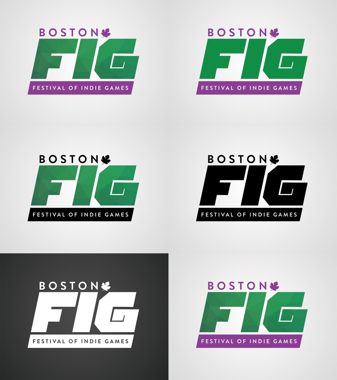
One of the final concepts for a rebranding of the Boston Festival of Indie Games that I've been working on with their creative & marketing team. We wanted to preserve the iconic fig leaf and its brand colors while also striving to achieve a modern and more confident tone.
The "FIG" letters were custom-cut from geometric shapes and are using a vector pattern inside of them to add some visual interest and variation along the themes of indie gaming.
As with any good logo, it has to work in black & white, false-color, when inverted, in flat-colors, and in two-color print. Shown here are all the common variations of the logo. This is still a WIP and will continue to be refined and updated as the rebrand of their website keeps going.
More by Akhil Dakinedi View profile
Like
