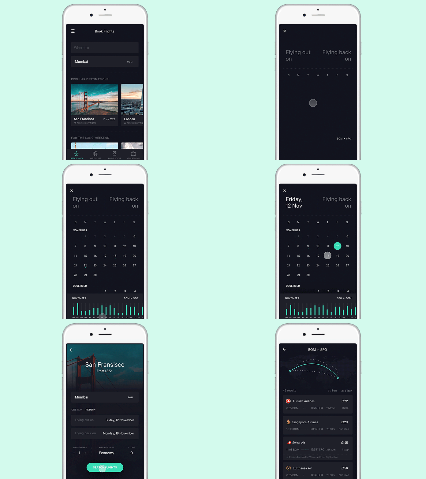
Calendar for flight app
Calendar interaction for the flight app concept I am working on.
Screen consists of two tabs — From and To. The from tab is automatically selected first. A user on selecting the date, the to tab is activated and the user then selects the date. A range is then highlighted on the box which clearly indicates the start and end date.
This provides the necessary visual cues whens selecting the date range and allows users to seamlessly book their dates without much hassle.
More screens coming soon.
Follow me : Behance
More by Jekin Gala View profile
Like


