metro christian living magazine
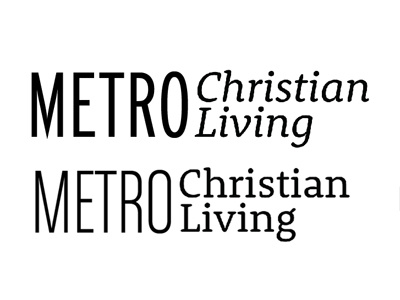
i've been working on this wordmark for over a month now. i do NOT like crosses in things, and i do not like cheesy stuff. i showed this to the editor today, and she said "i think Christian needs to be bigger."
all suggestions welcome. this has to be legible, because it goes over a photo on the magazine. i don't have much creative control or say in this.
i just want the type to be nice and i don't want it scaled (the other is scaled at least 70%!!!!! ahh!
